About Curves, Fits, Slopes, and Graphs
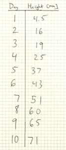
It all begins with some data. Here is a table of data points showing the height as a function of time for a plant that's growing. If we wanted to predict how tall it would be at a later date, we can use this data. From the first entry, after one day it has grown 4.5 millimeters. Thus we might expect after 2 days, it would be 9 millimeters. However, the next data point shows that our measurement at day 2 was not 9, but 16 mm. So maybe we would revise our prediction and say that since it grew 16 millimeters in 2 days, it really grows at a rate of 8 millimeters a day, on average. Clearly, we not only need more data, but we have to revise our approach to interpreting it!
Tables of data are not the most useful way of presenting the data. Plots allow for much more rapid and clear communication of the science contained in the data.
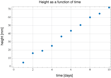
Here is a plot of our table of data for 10 days. On the horizontal axis is time, the vertical axis is height. We can see by looking at it that it's probably a linear relation. This means that we could use a linear equation to predict the value of y given an input value x. There would be some constant $m$ that would serve as the proportionality constant between these values. $$y = m x$$
Using software, we can take our data and generate a fit. This would be a line that tries to go as close to every point as possible. Once the software does this, it reports back the equation of the line, along with other information about the process.
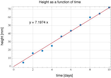
Now we have both the data and the fitted line shown on the same plot. The equation for the fitted line is also shown. It tells us the slope of the line is close to 7, but not exactly 7.
In the case shown above, we can see that the data essentially corresponds to a line with a slope of about 7 mm/day. Considering what is being plotted, this makes sense.
Of course, not everything we measure will be linear. For example, the distance as a function of time for a freely falling object can be shown to be a quadratic relation. $$y = -\frac{1}{2}g t^2$$ This is a parabola (concave down). There are plenty of other examples that we'll see later on. Let's say we took some data, for example, the heat dissipated by a resistor as a function of the current passing through it. It might look like this.
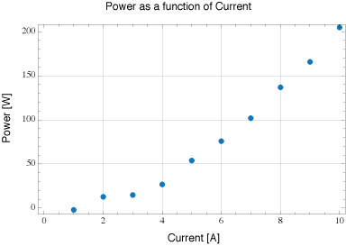
This is the raw data obtained from measuring the power as function of current.
We can try fitting a linear line to the graph.
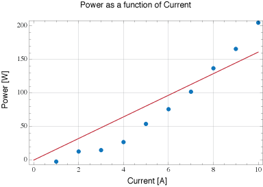
A quick visual inspection shows that a linear fit does not appear to be a very good choice.
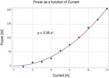
Here is the same data plotted with a quadratic fit. Meaning, we look for a line given by $$y = mx^2$$ to fit the data to. We can see that the 2nd order coefficient is approximately 2 based on the fit.
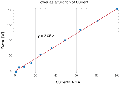
Another method of plotting the data is to plot the Power as a function of Current squared: $P(I^2)$ This enable us to again use a linear fit. This enables us to use the linear fitting function to extrapolate the coefficient. If we let $z = x^2$, then the plot shown at left is really plotting $y = m z = m x^2$, where $m$ is the slope. If our function was something more exotic, like $y = m \cos (x)$, we could let $z = \cos (x)$ and then plot $y = m z$ and obtain a linear relationship in order to determine the value of $m$ .